Janus Henderson · Dave Batt
Headquartered in London, Janus Henderson provides a wide range of investment solutions to individual, institutional, and intermediary investors worldwide.
While working at Gravity Global, I was brought in to review and refine the visual consistency of their digital advertising campaigns.
Client
Janus Henderson
Deliverables
Design Audit
Report of Findings
Campaign Masters
Creative team
John Taylor
Rana Dias
Dave Batt
The Challenge
Over time, Janus Henderson’s digital campaign assets had begun to drift visually. Each new campaign looked increasingly different from the previous one, resulting in a lack of cohesive brand identity across digital channels.
The core challenge was to identify why this inconsistency was happening and to establish a system that would prevent further deviation—while still allowing flexibility for future creative.
Process
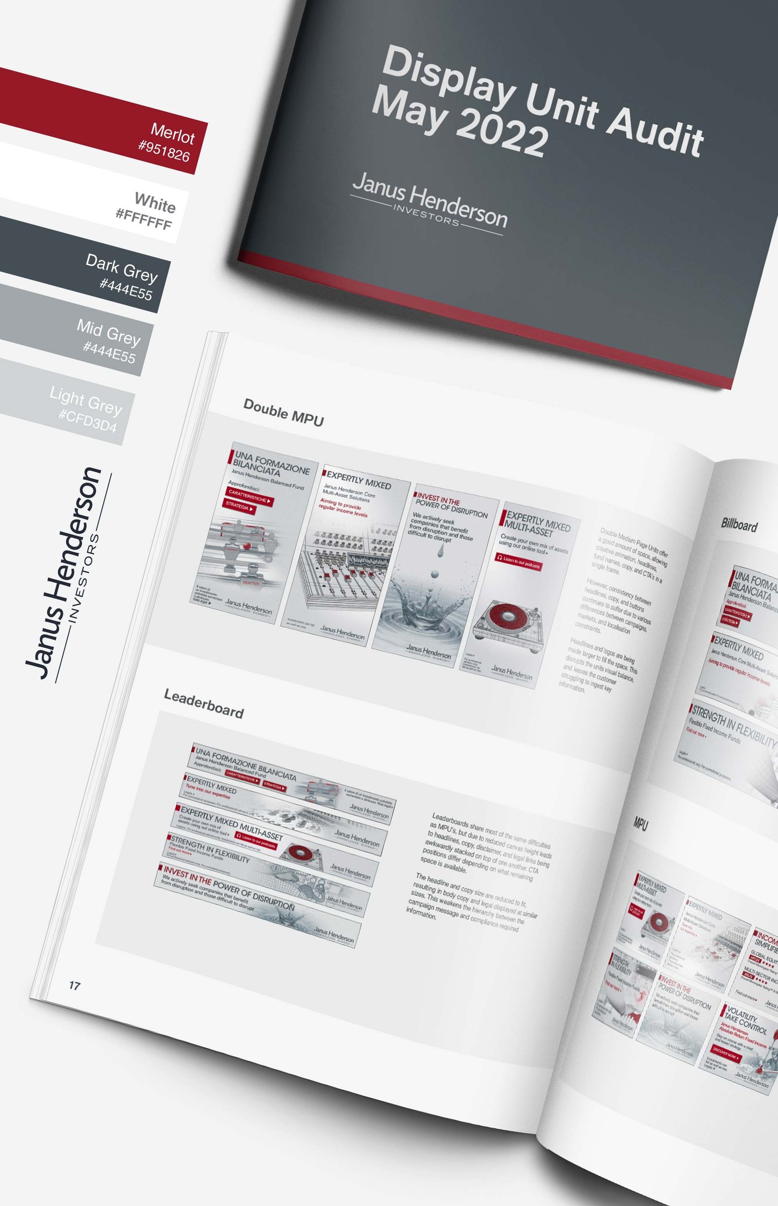
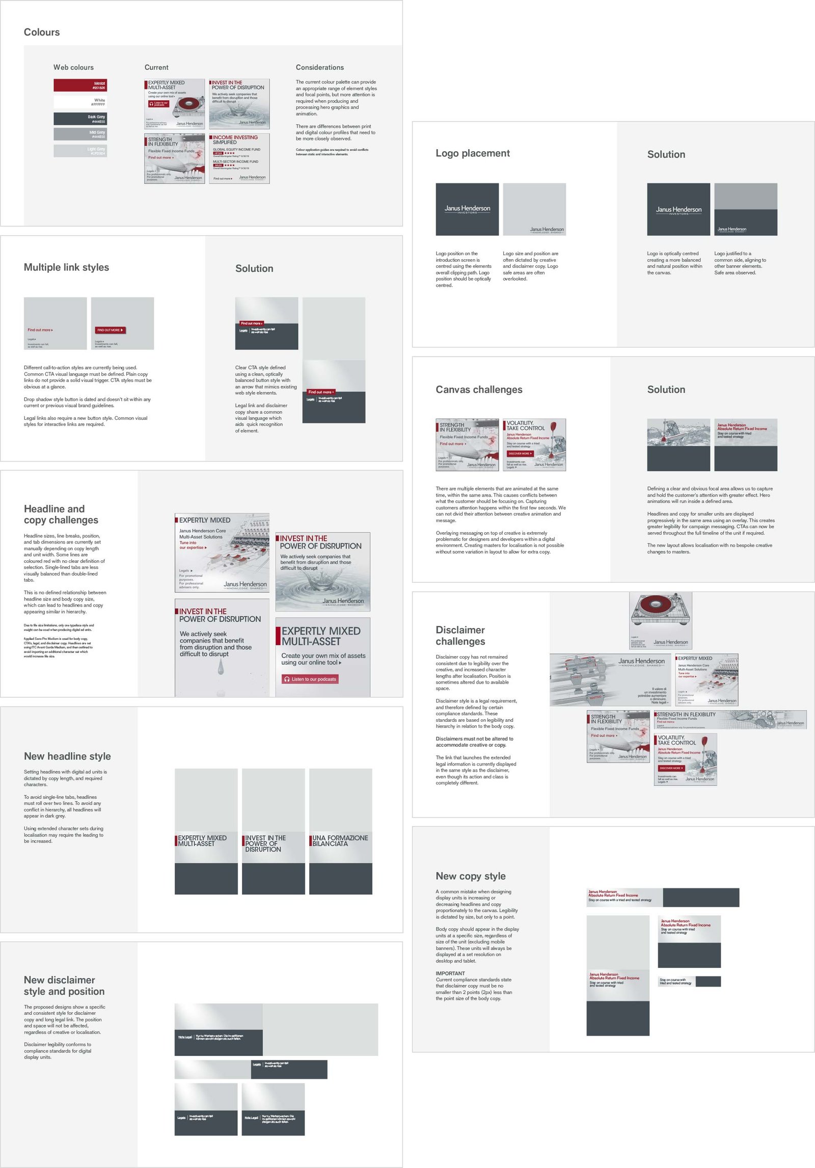
The first step was a comprehensive audit of previous campaign assets. This involved analysing multiple sets of display ads to identify the core components and how they were being used.
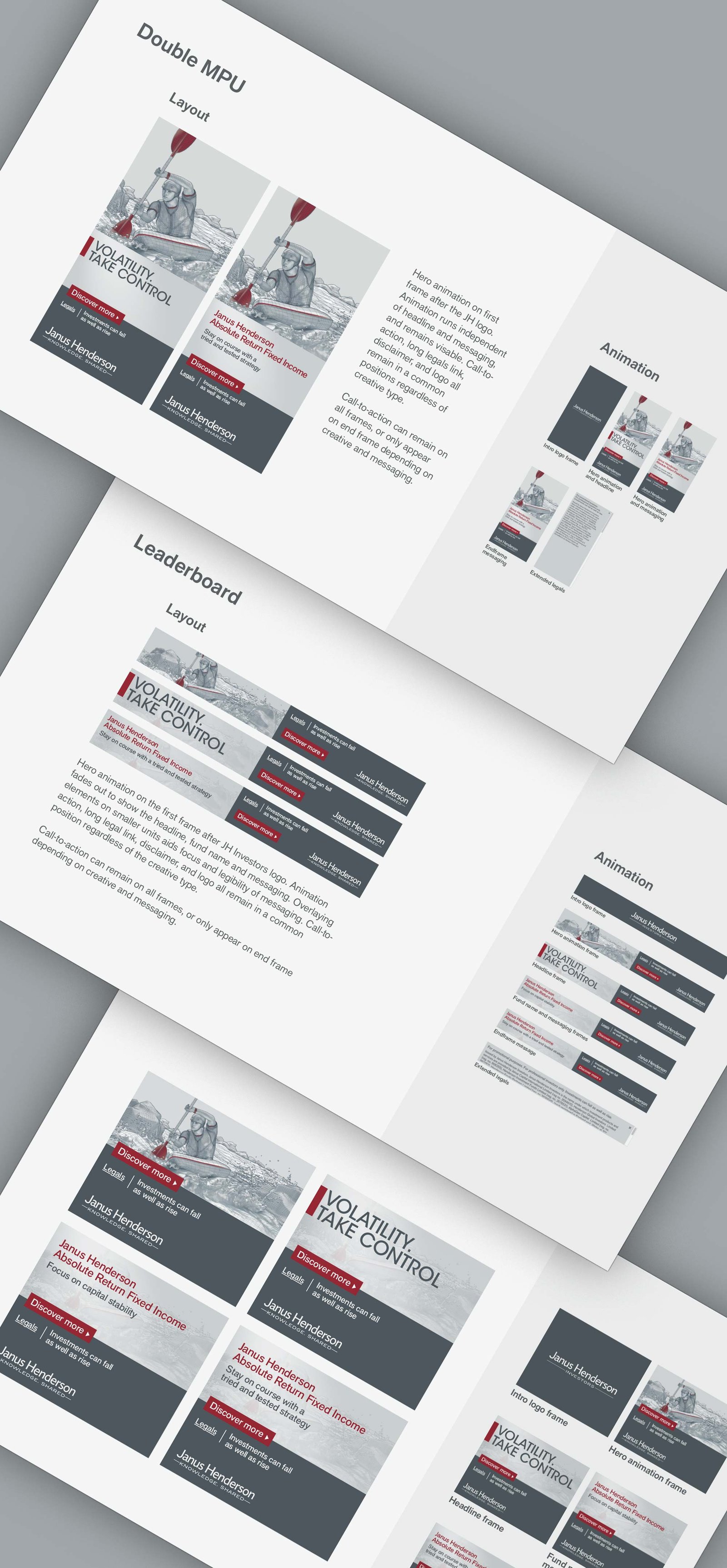
At a structural level, each campaign contained the expected elements—hero imagery, headlines, supporting copy, calls-to-action, logos, and legal text. There were also recurring patterns in animation styles. However, when compared side-by-side, every individual element had subtle variations.
Even the core brand colours—limited to just three—had shifted noticeably between campaigns. This was largely due to inconsistencies in production workflows, particularly the improper conversion between CMYK (print) and RGB (digital), leading to colour degradation over time.
Beyond visual inconsistencies, layouts also needed to be robust enough to handle localisation. In some cases, translations (such as English to German) significantly increased copy length, putting additional strain on existing designs.

My Role
I led the audit of existing campaign assets, identifying the root causes of inconsistency across design, production, and delivery.
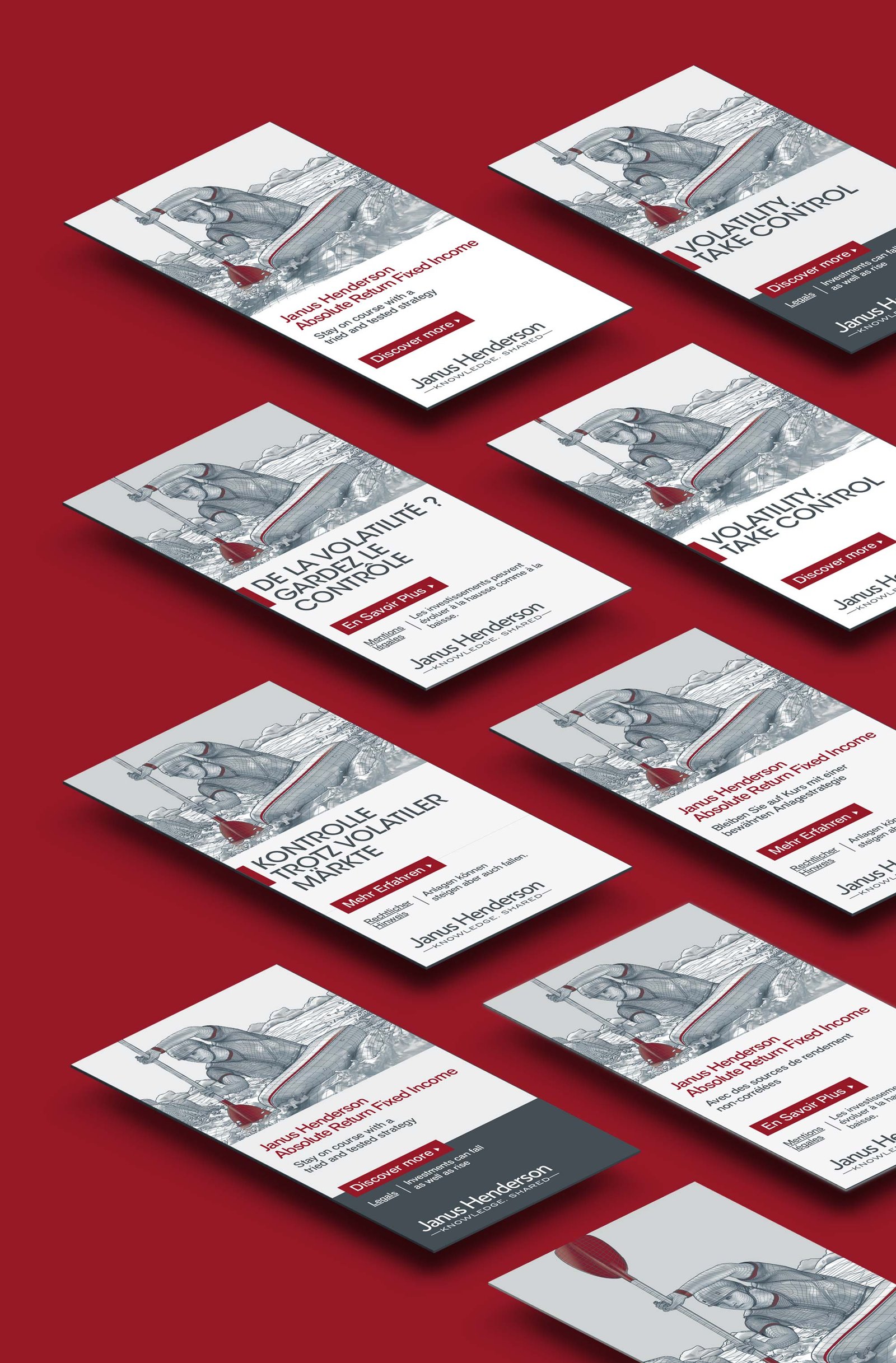
Based on these findings, I developed a new set of modular ad templates along with clear design rules and production guidelines. These templates standardised the use of typography, colour, layout, and animation, while remaining flexible enough to accommodate different messaging and languages.

Results
The new template system established a consistent visual framework for all future digital campaigns. By introducing clear guidelines and production standards, it reduced variation across assets and ensured stronger brand cohesion.
Additionally, the templates were designed to accommodate localisation from the outset, making them more scalable and efficient for global campaign rollouts.
Overall, this approach improved both the quality and consistency of Janus Henderson’s digital creative, while streamlining the production process for future campaigns.