Reltio · Dave Batt
Reltio is a cloud-based software company that enables organisations to unify and manage data from multiple sources into a single, trusted view.
Its AI-powered platform transforms fragmented data into real-time insights, supporting better decision-making, improved customer experiences, and more efficient operations. I was contracted by Transmission to deliver design solutions for Reltio’s website, applying their newly developed brand direction.
Client
Reltio
Deliverables
Website refresh
Brand visuals
Creative team
David Gyertson
Stefan Kraft
Dave Batt
The Challenge
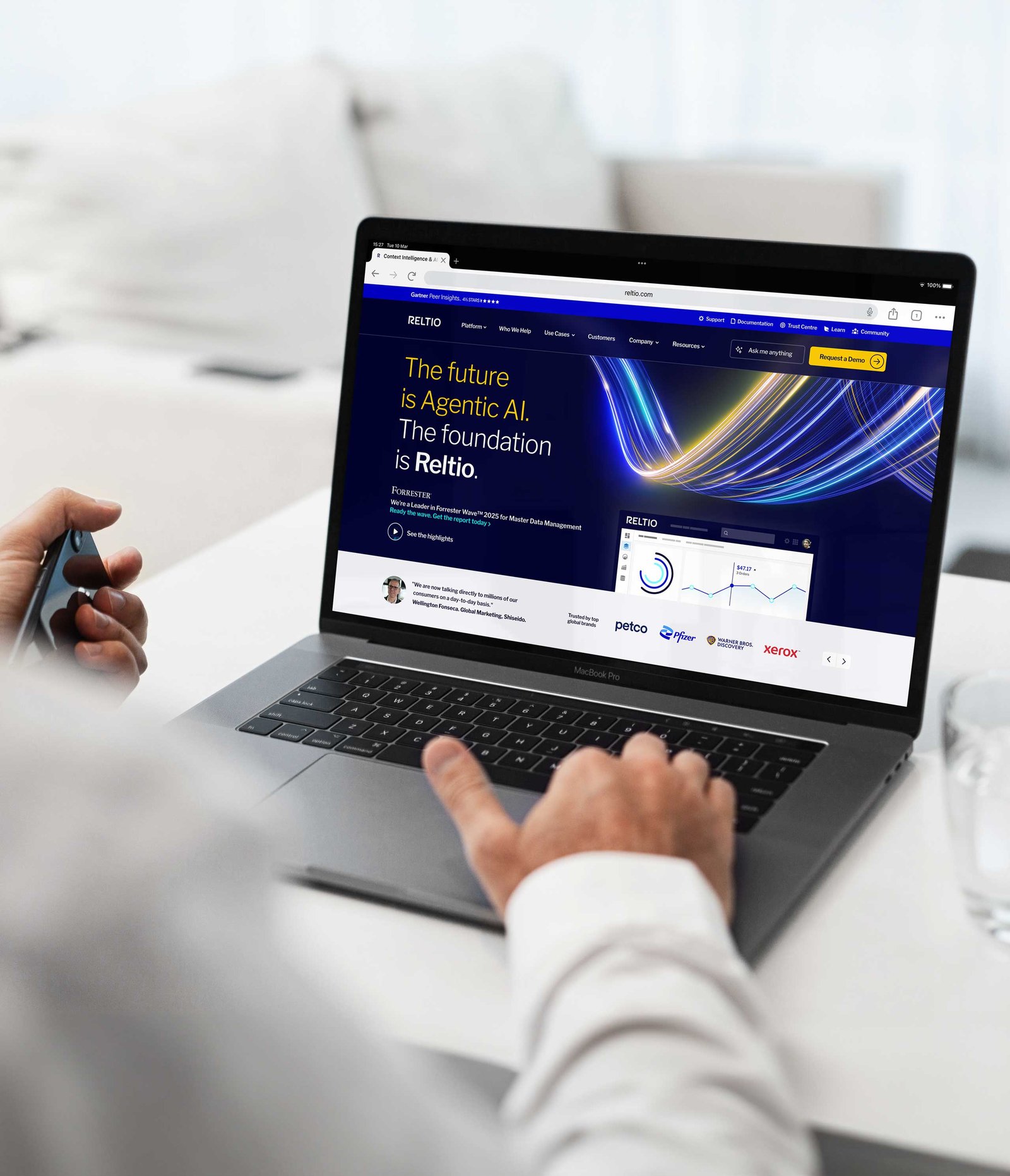
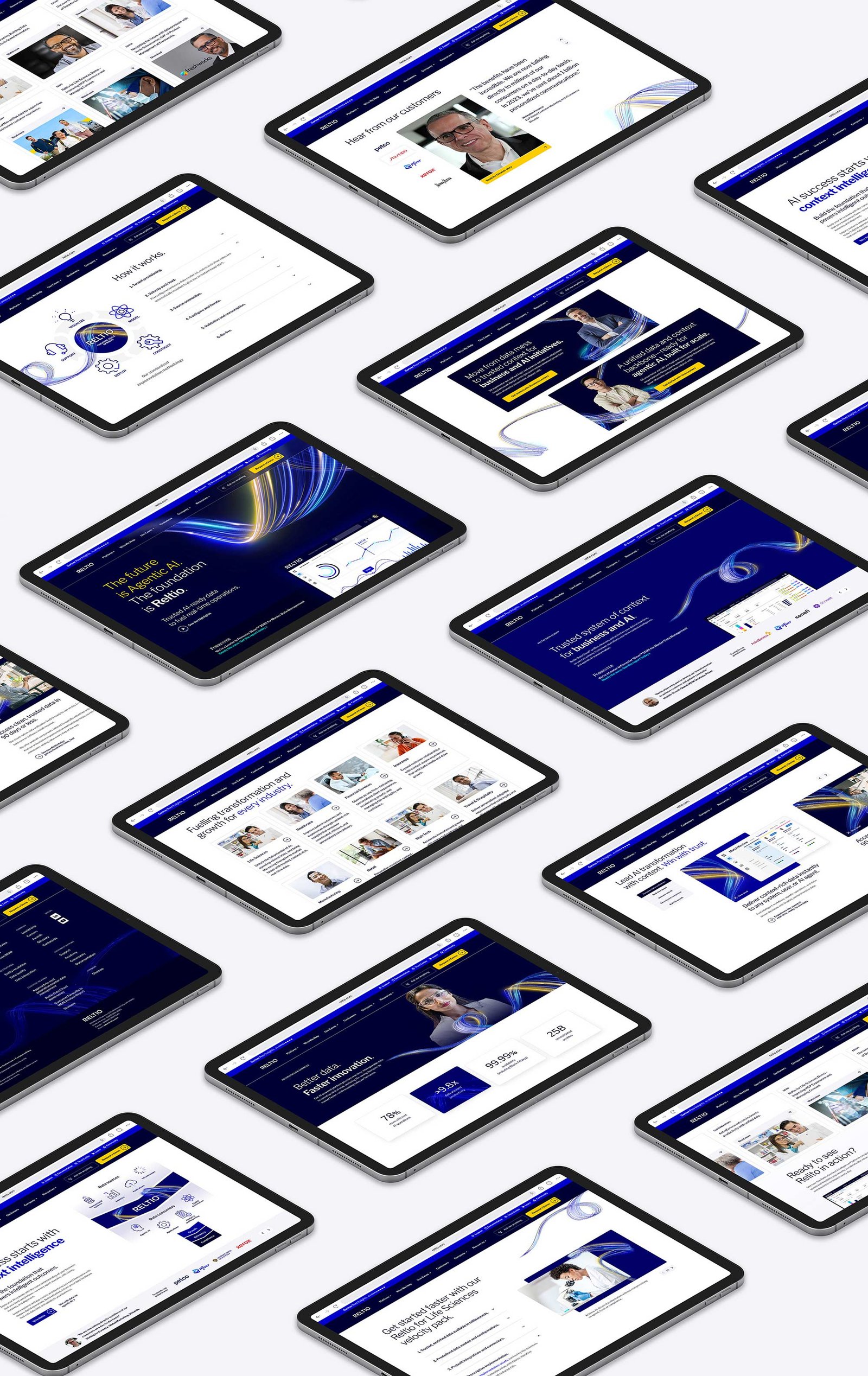
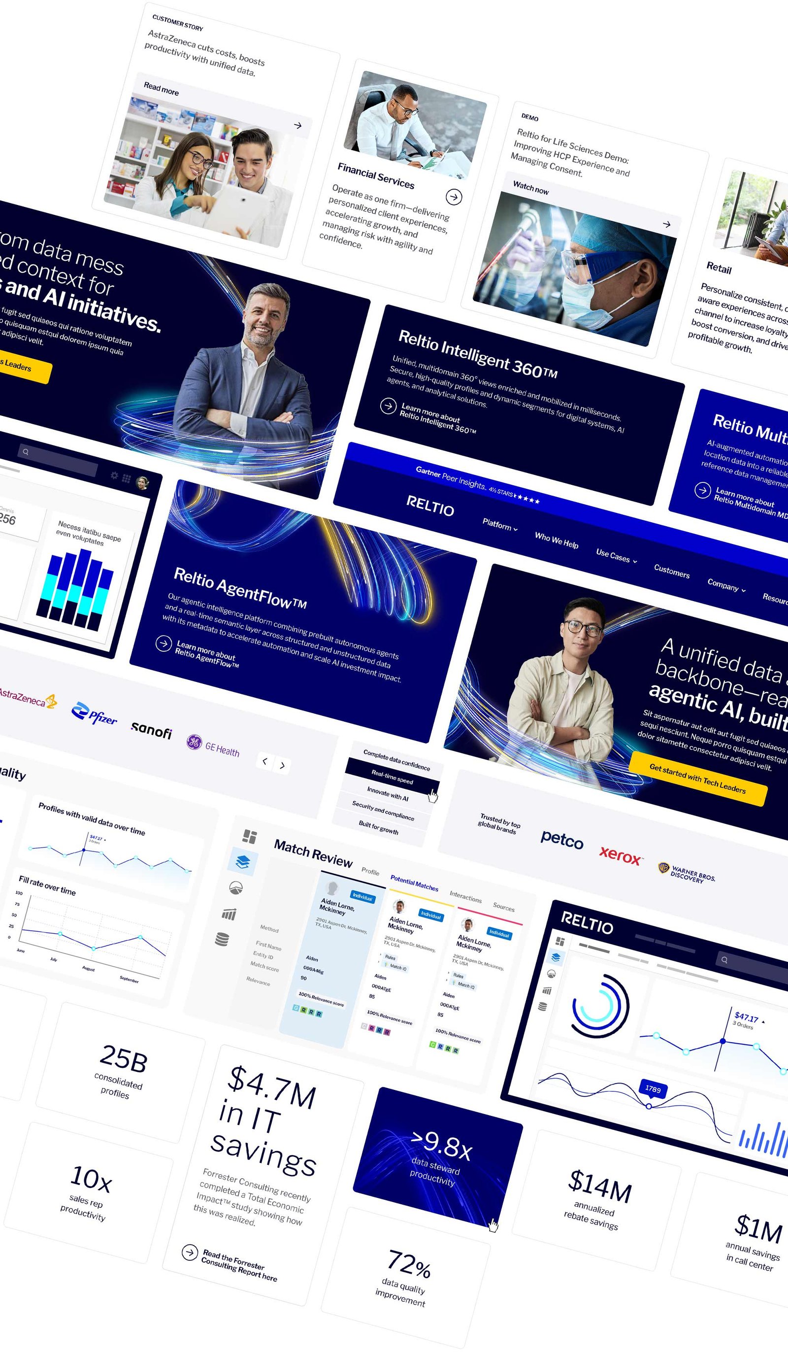
Reltio’s existing design language no longer reflected the speed, intelligence, and efficiency of its AI platform. Transmission’s creative team introduced updated visual assets and motion concepts, alongside a strategy to streamline user journeys and improve how information was communicated across the site. The challenge was to implement this refreshed direction while enhancing clarity, consistency, and usability.
My Role
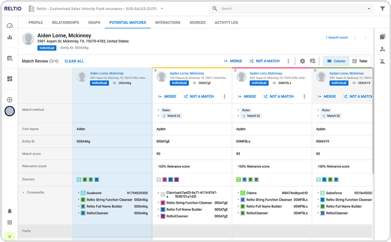
I was responsible for translating the new brand language into scalable, responsive web designs. This included updating existing components, modules, and layout systems to produce cohesive page designs aligned with the provided wireframes. I also created supporting product visuals, including application screen graphics and illustrations, to clearly communicate key platform functionality.
Process
The project required balancing visual transformation with technical and operational constraints. Working within an established framework, timeframe, and budget meant that much of the existing site structure and functionality needed to be retained.
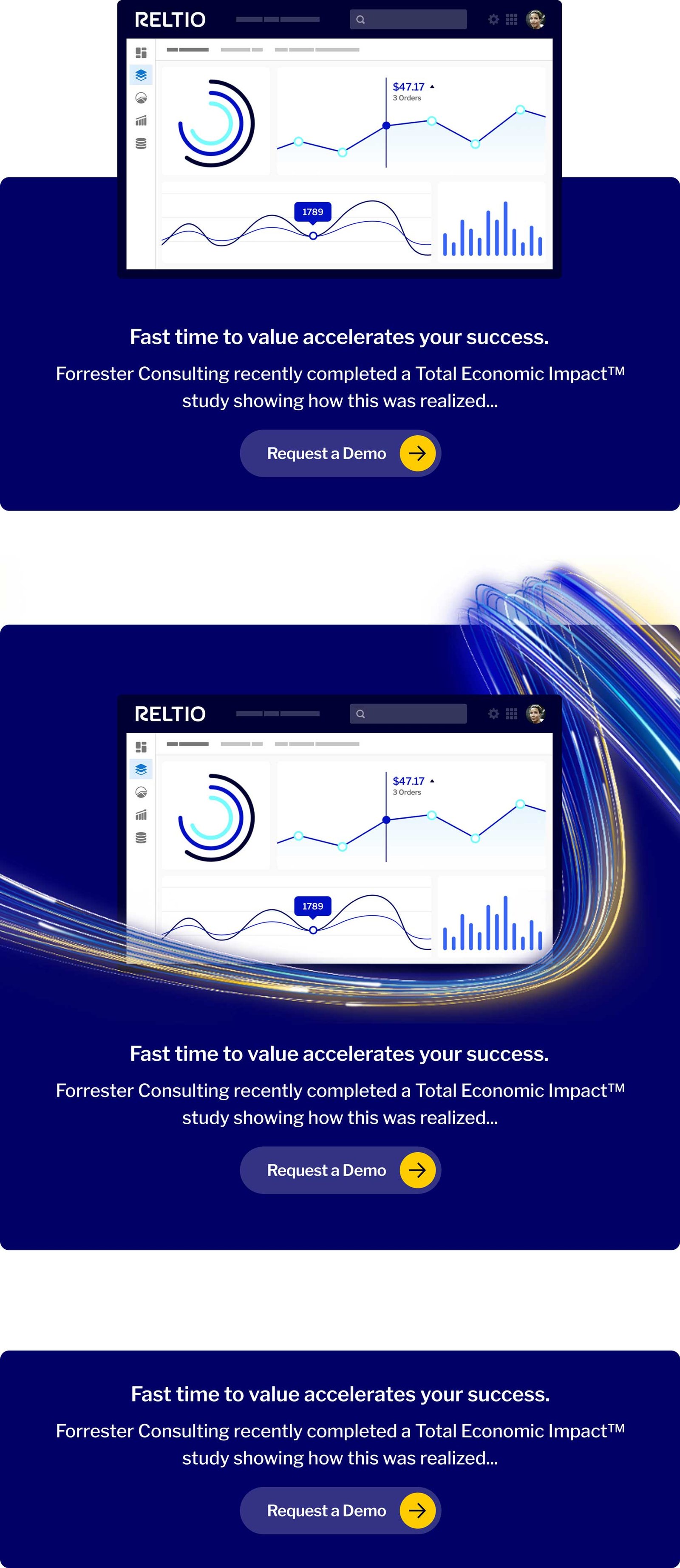
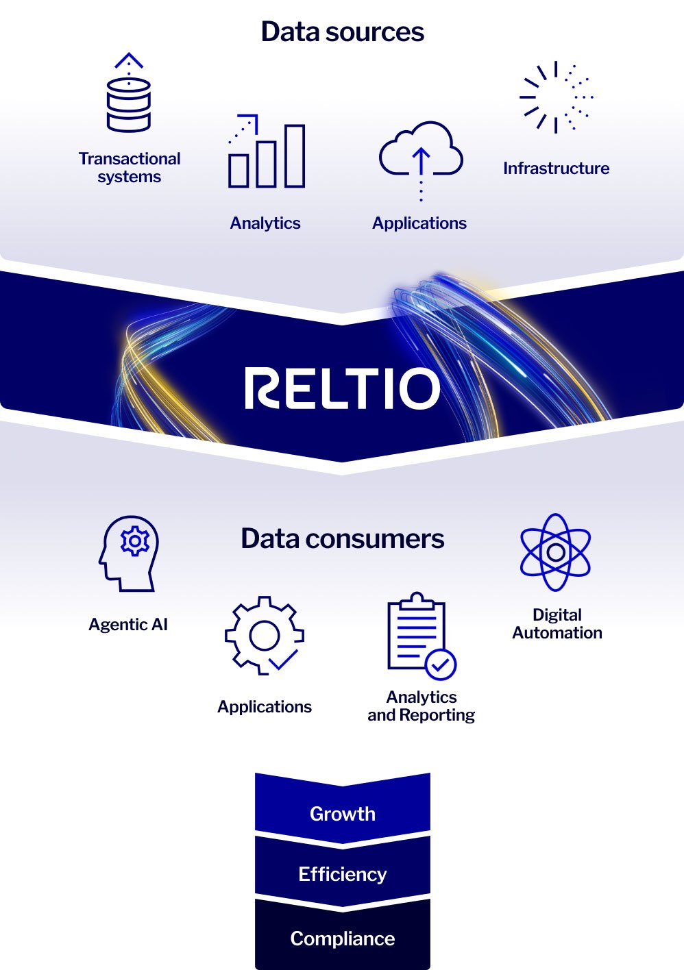
Supporting graphics describing a function or process that could not dynamically change with different window sizes were designed in portrait, therefore remaining legible for mobile displays.
As a result, the updated design approach focused on layering the new visual language onto existing components and styles, ensuring consistency while minimising disruption. Careful consideration was given to maintaining visual coherence, improving usability, and aligning all updates with the refreshed brand standards.
At vero eos et accusamus et iusto odio dignissimos ducimus qui blanditiis praesentium voluptatum deleniti atque corrupti quos dolores et quas molestias excepturi sint occaecati cupiditate non provident, similique sunt in culpa qui officia deserunt mollitia animi