CTWO · Dave Batt

Brand exploration and digital strategy for an AI universal orchestration platform.
Role
Design Lead & Digital Strategy
Scope
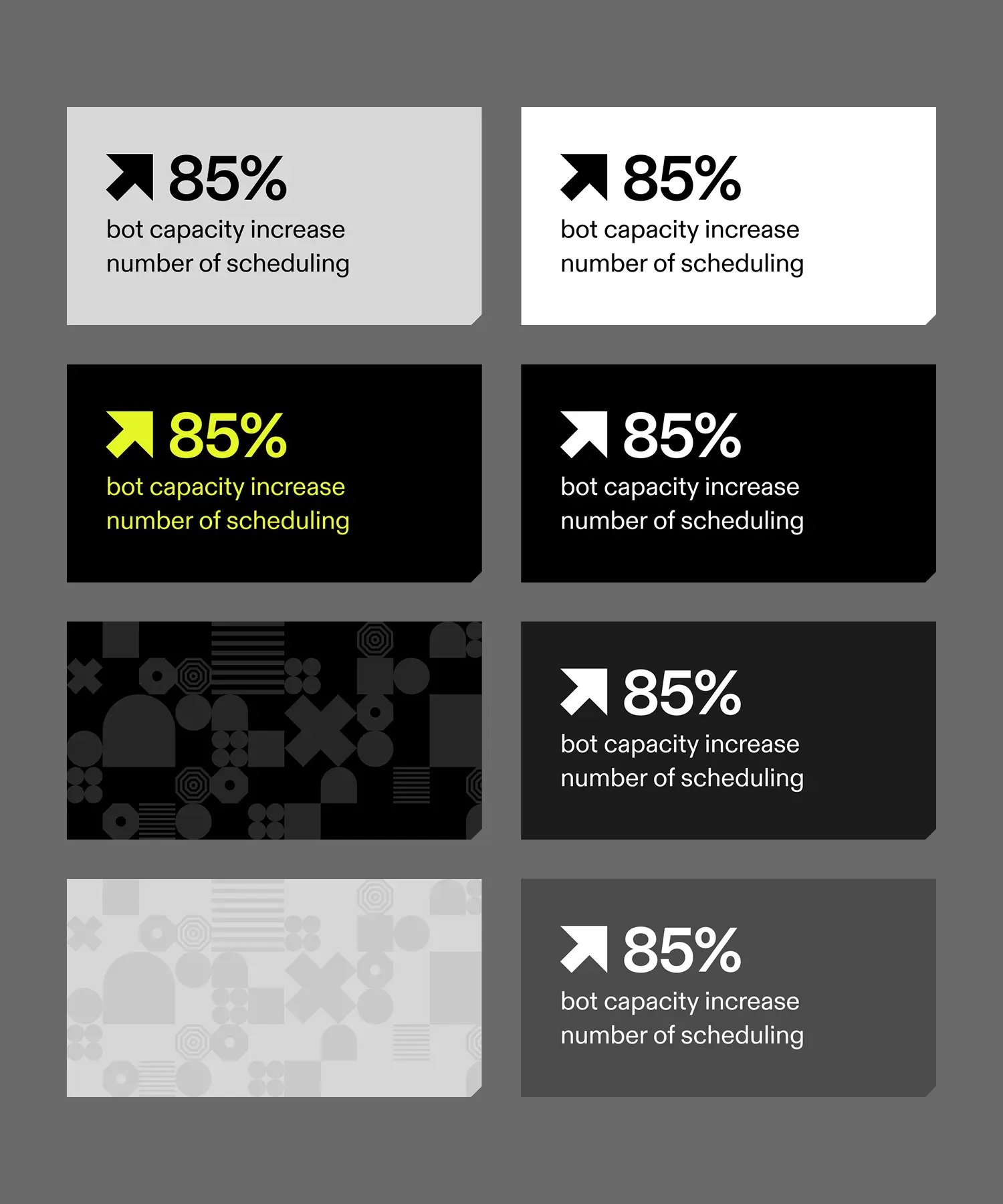
Responsive website, design system, brand guidelines, content strategy.
Duration
Three months
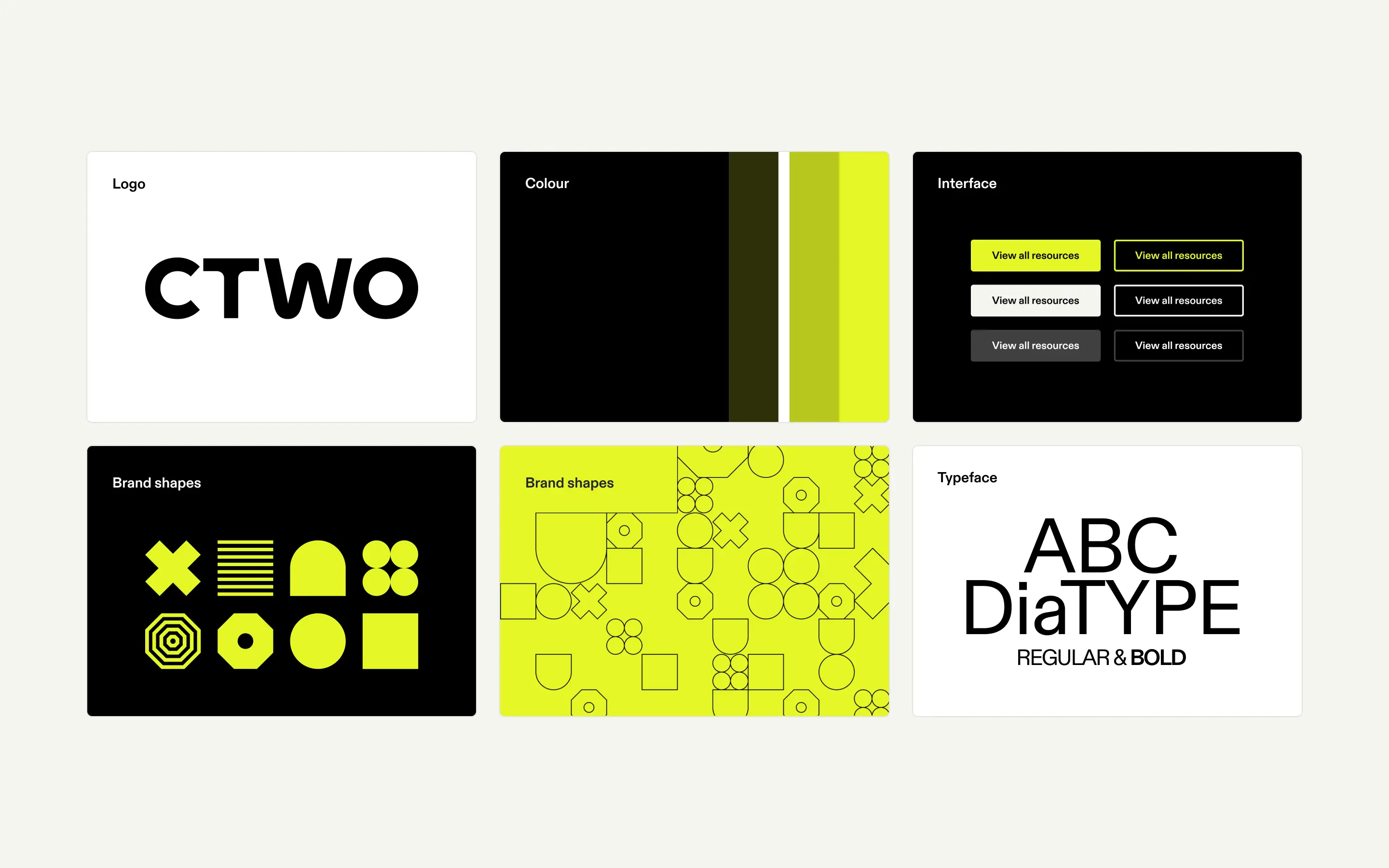
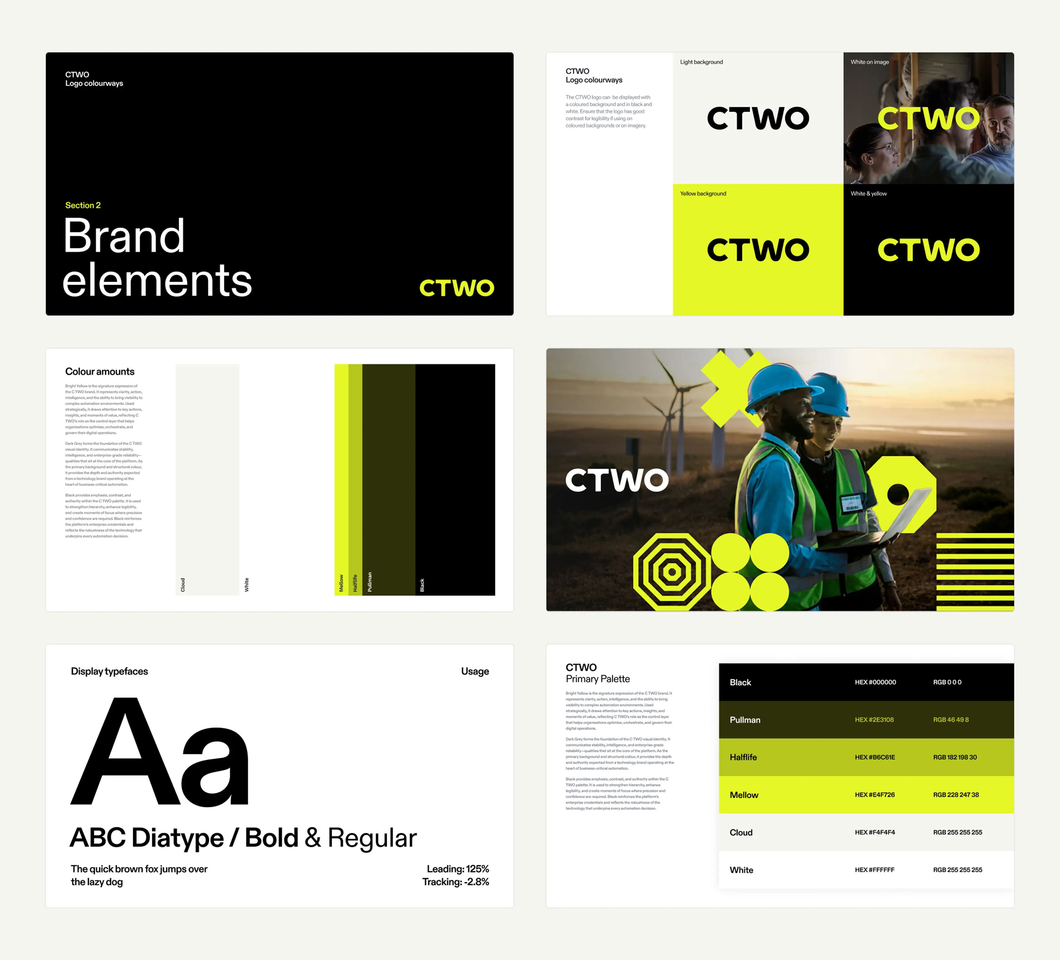
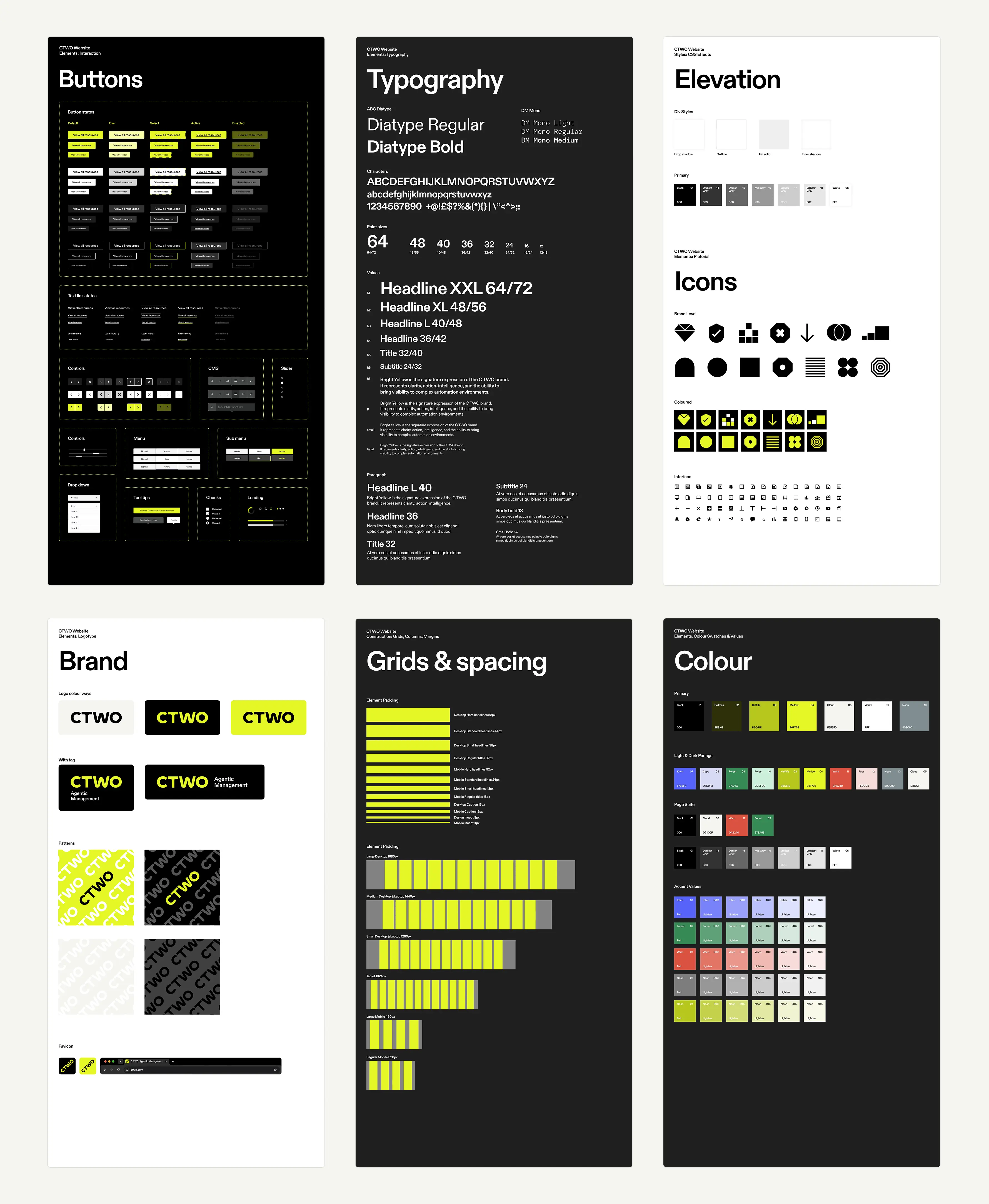
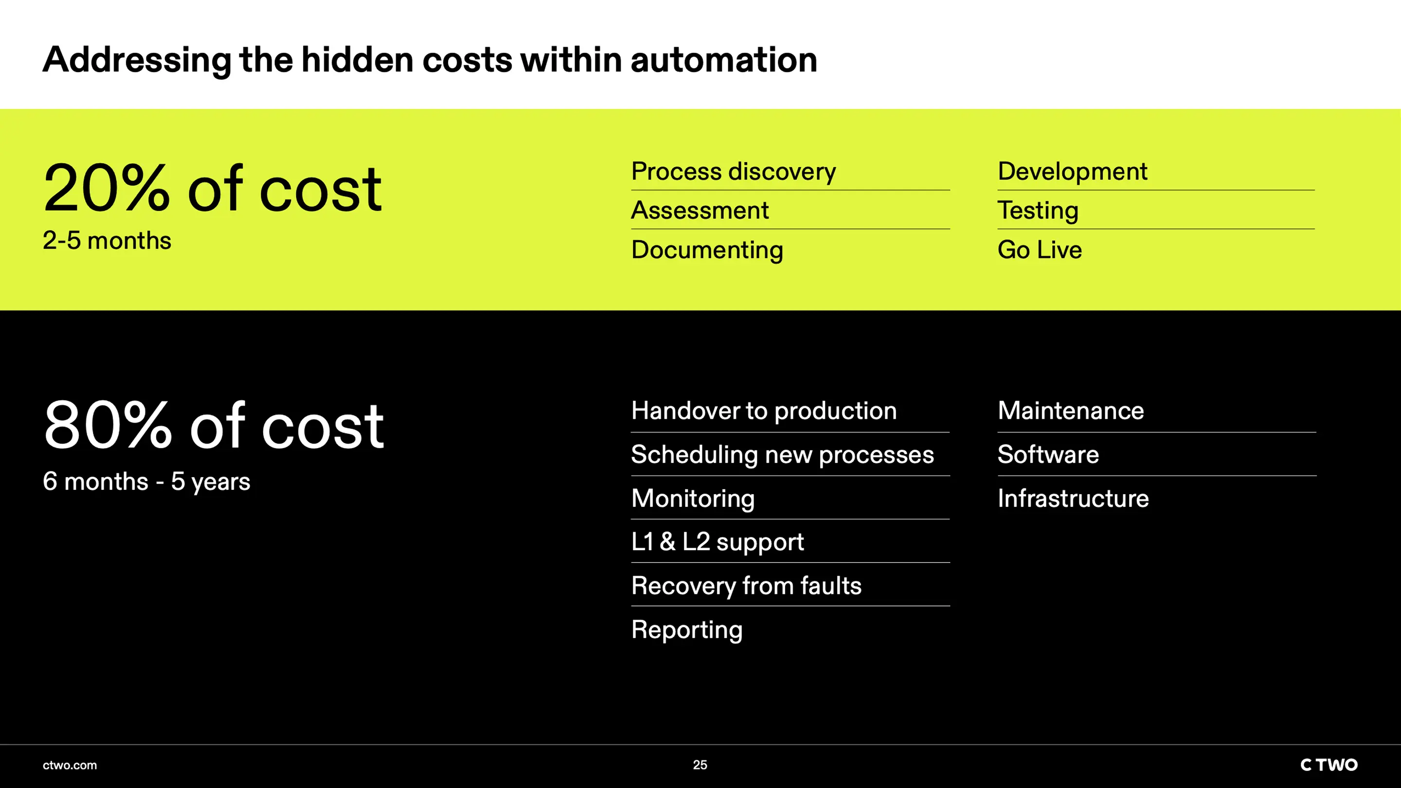
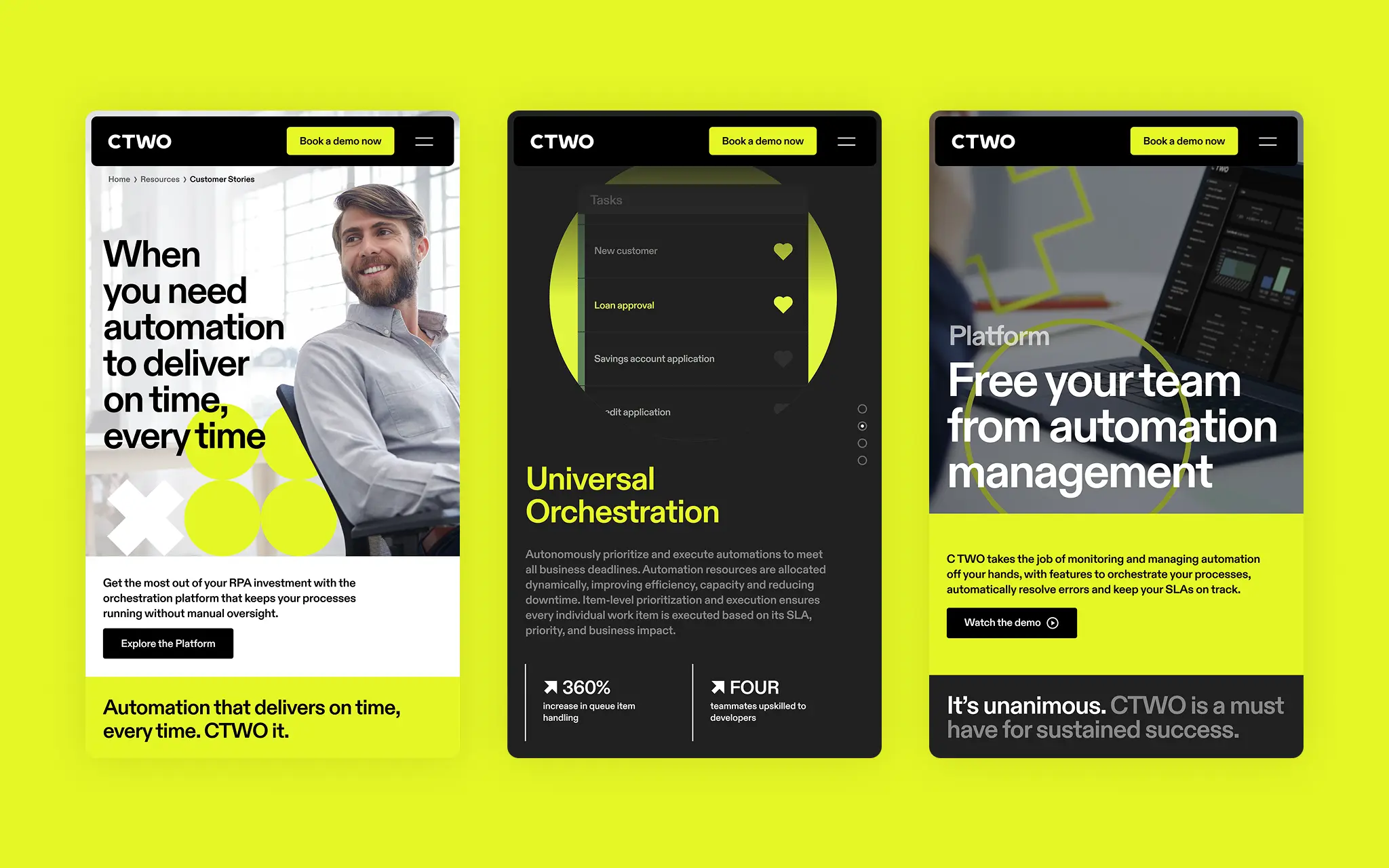
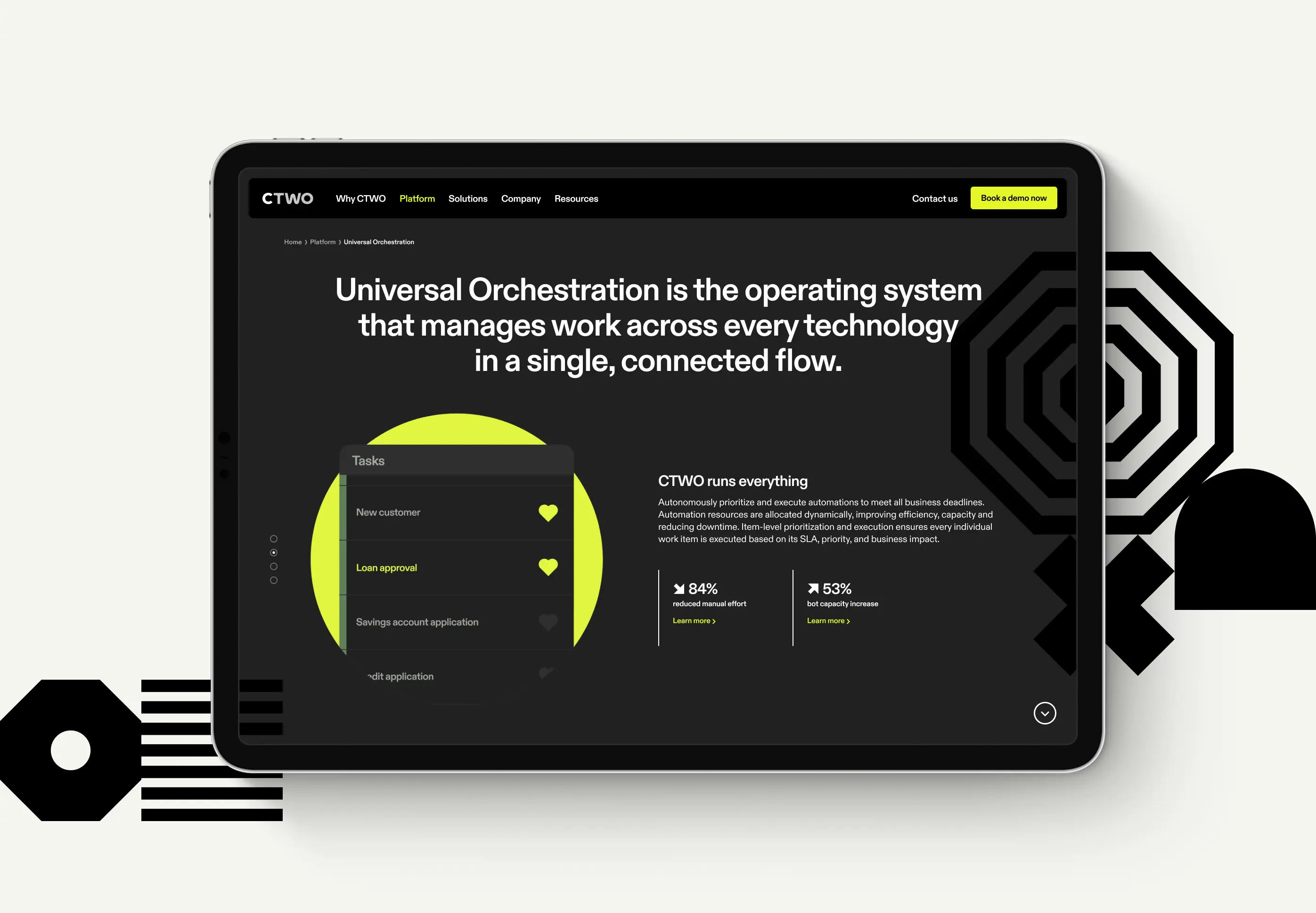
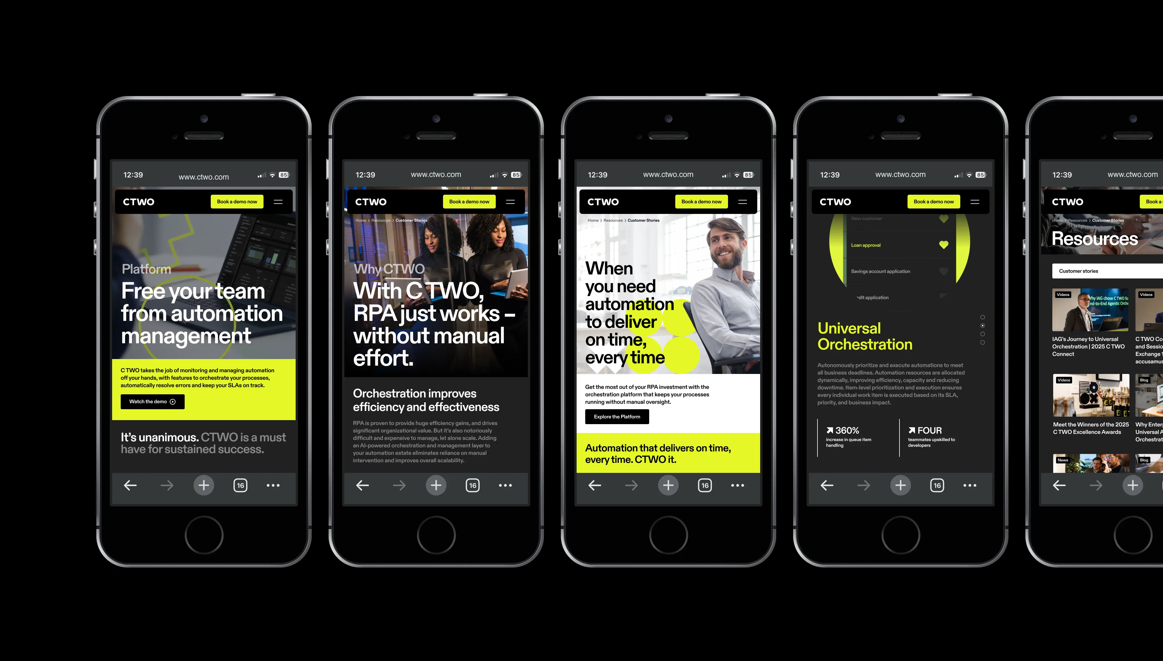
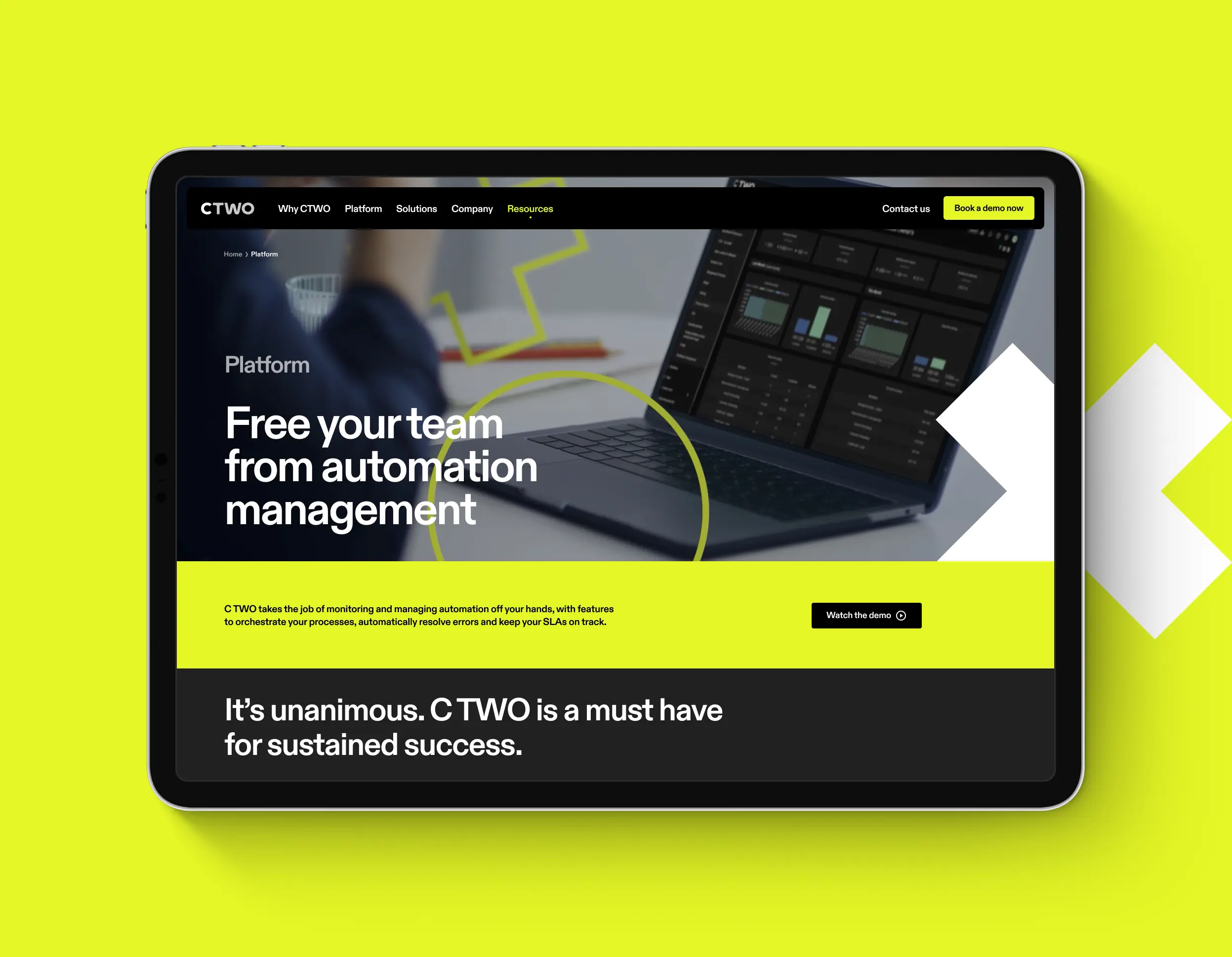
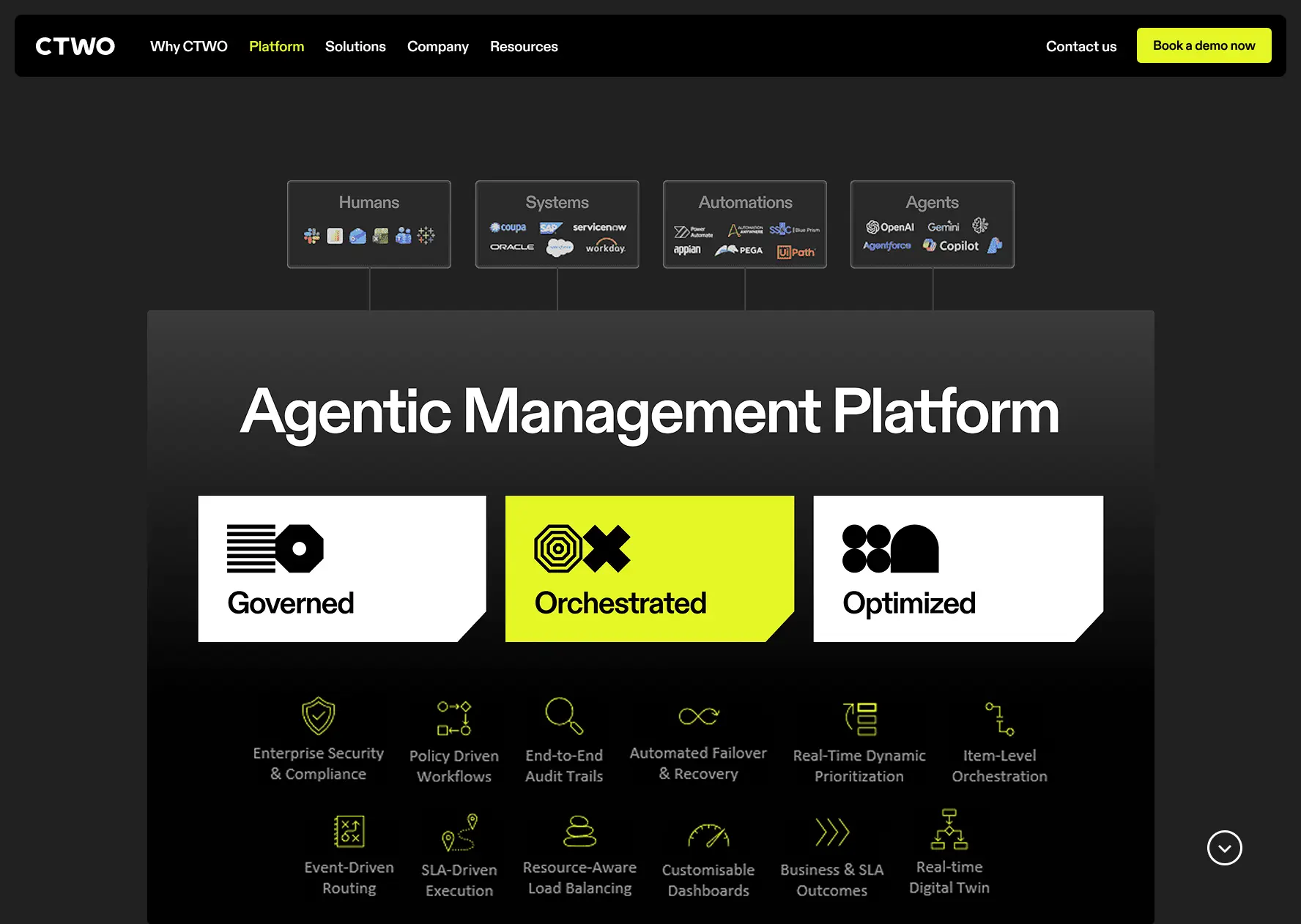
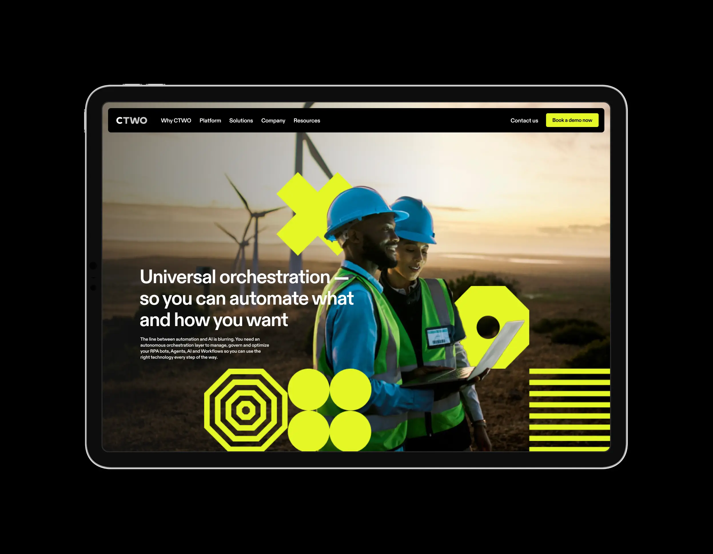
The platform is designed to help organisations improve efficiency, scale automation efforts, and maintain compliance across complex operations. The goal of this project was to redesign CTWO’s public-facing website so that it more accurately reflected the sophistication and value of the platform, while making its capabilities easier to understand for prospective customers.